When I launched a second edition of Cold Email for Interesting People, I also re-built its landing page on my website. There are plenty of tutorials demonstrating how to design a basic landing page. And every indie developer aspires to create something as slick as Stripe's homepage. But the intermediate steps remain uncharted waters.
This article covers how to take your landing page from a 5/10 to an 8/10.
In other words, we go from a basic, competent Bootstrap landing page that functions well on mobile to an intentionally designed page that you could build with any CSS framework (I'm still using Bootstrap) and actively looks good on a variety of screens.
There isn't any code in this tutorial (though the new page is open source). Instead, it covers the design choices and thought process behind the upgrades, so it is applicable regardless of what no-code webpage builder or front-end framework you use.
For this visual topic, I took the time to record the content in a livestream-style video, embedded below. It covers roughly the same information as this writeup.
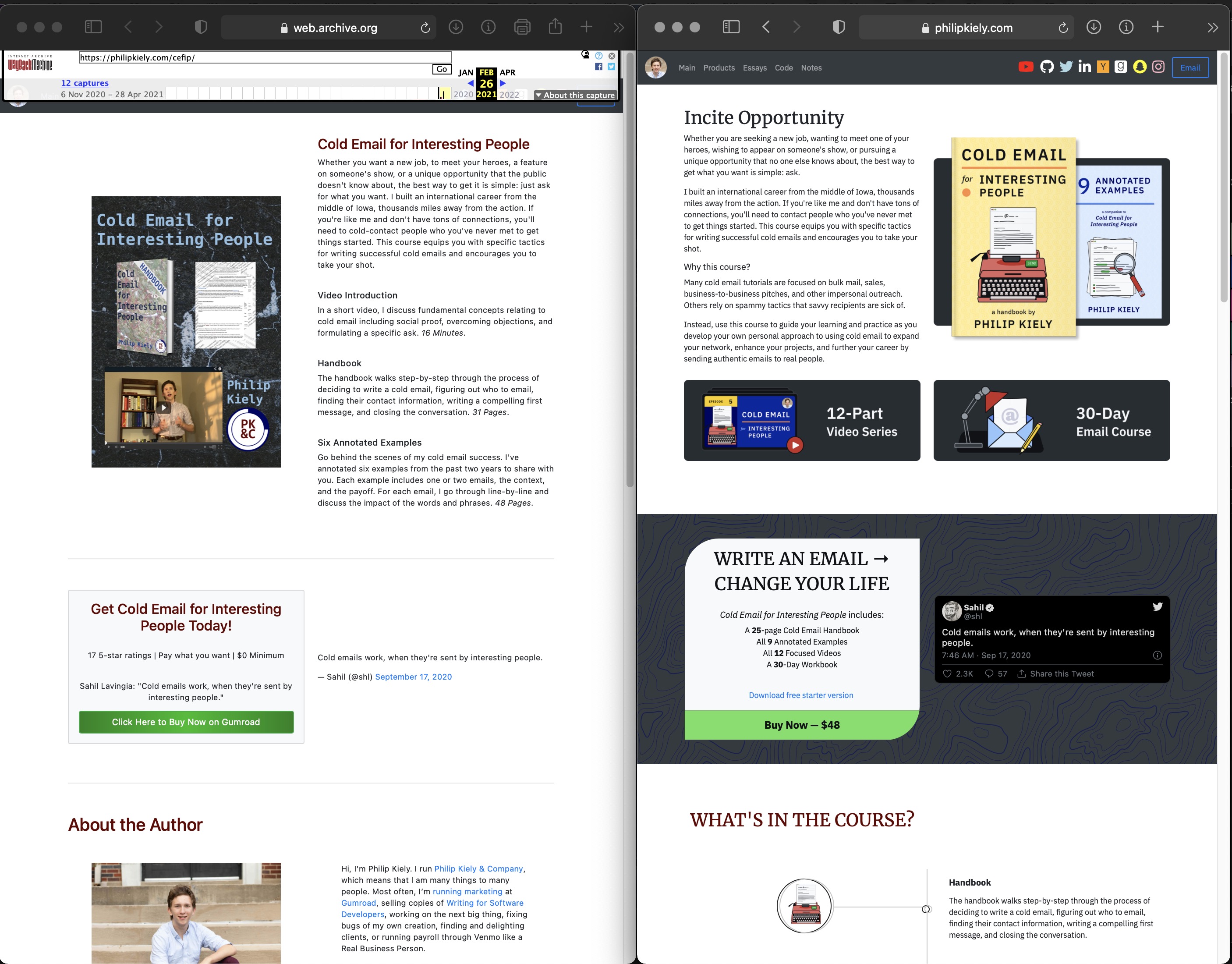
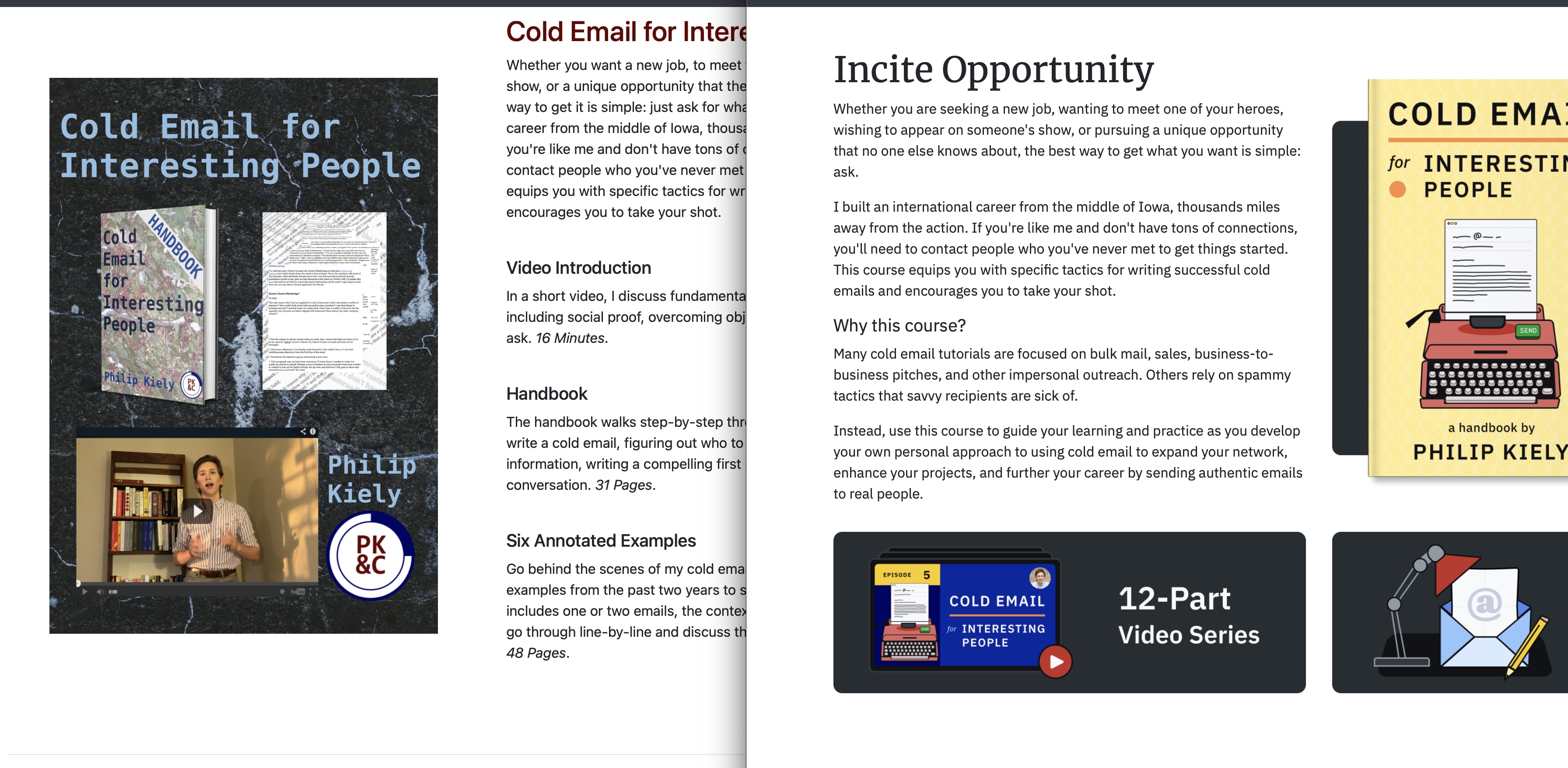
The Original Page
Rather than embed a full-length photo of the old site, I tracked it down on The Wayback Machine so that you can peruse it at your convenience. At the time of writing, everything except for the tweet embed works; the page presents nearly its original design.
I created this webpage in November 2020 during a 14-day product challenge as part of creating the first edition of Cold Email for Interesting People.
The New Page
Again, this is easiest if you visit the page in another tab or window.
I created this version in April 2021. Per my time tracking, the page took about fifteen hours of focused work time: ten on design/implementation and five on copy.
I'm not claiming that this is the greatest landing page ever created. Far from it. However, it is substantially better than the original. Examining why should be helpful for both of our learning about design.
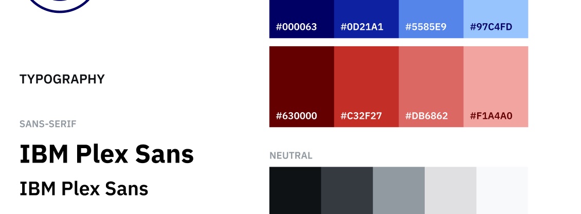
Style Guide
The first advantage I had in creating the new page was a style guide. One of the two fonts and all of the colors came from the PK&C style guide. Having a style guide is helpful because it reduces the number and complexity of decisions you make while designing. Instead of "which color should this button be," you ask, "which of these four distinct shades of green should this button be."
Graphics
The not-so-secret weapon in the redesign is a collection of a half-dozen graphics that a student intern created over the winter. Beautiful parts have a better chance of forming a beautiful whole. And fortunately, it doesn't take many graphics to level up a webpage. Depending on how you count them, the page relies on six to eight distinct pieces of graphic design. It took many more to get there, but a handful of nice assets is within many a creator's ability or budget.
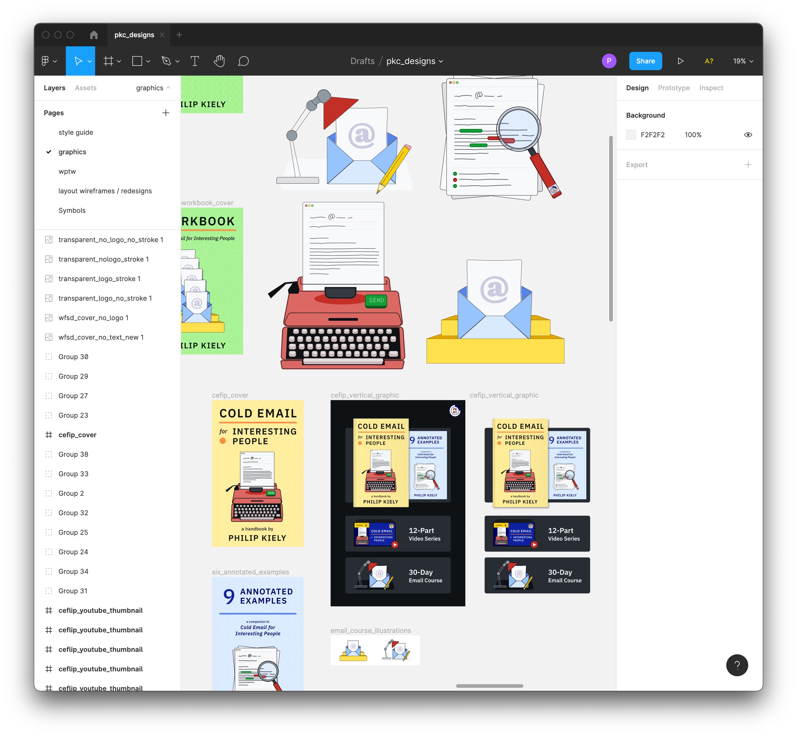
These assets are particularly valuable thanks to their flexibility. They have clear backgrounds, are large enough to display at high resolutions yet simple enough to serve as icons, and look at home on the website and in the product. They are also consistent: they share colors and a hand-drawn aesthetic.
Resources
A handful of other assets aided in the redesign:
- The font IBM Plex Sans for body copy
- The font Merriweather for headers
- The "topography" svg from heropatterns for backgrounds
- This Bootstrap Timeline Template for one section of the page
The new site is written with the same Bootstrap 4 as the old one, but incorporates these additions and more custom CSS. I didn't do anything particularly sophisticated, but I was able to take my time and iterate through designs until one felt right.
Order of Information
A designer's most important job is displaying information with the correct hierarchy. On a landing page, order of information depends on its importance. If you have fantastic copy at the bottom of the page, it doesn't matter if readers click away before they get there.
In this comprehensive re-design, one thing that did not really change was the order of information. The new site has a seven sections, rather than 5, and the second CTA (Call to Action) is more centrally located, but otherwise it isn't that different.
Old Site:
- Main image and opening copy
- CTA
- About the Author
- FAQ
- CTA w/ Social Proof
New Site:
- Opening copy and main image
- CTA
- (new) Product Description
- (new) Social Proof
- CTA
- About the Author
- FAQ
As the second CTA is such an major presence on the page, there is not a third CTA at the bottom of the page.
If the order of information wasn't significantly different, what can we attribute the change to?
Background and Spacing
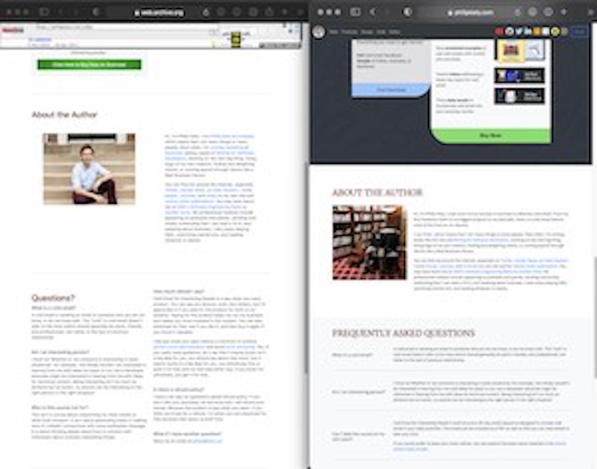
In the original page, I used a two-colomn layout exclusively that re-arranged to a single column on mobile devices. In the new page, the column structure varies: usually two (of the same or different sizes), but sometimes one or three. The following picture is intentionally blurry; use it to consider shape over specifics.
Varying the column size and layout avoids reader fatigue, and so does introducing colored backgrounds on certain sections. Giving the CTA sections a dark background and the FAQ an off-white background at the full page width interrupts a monotonous scroll.
Despite the full-width backgrounds and changing columns, the contents still live with consistent, wide margins at the edge of the page. It just doesn't look like everything is the same size anymore, even though it is.
Thanks to bootstrap, both sites stack their sections into a neat single-column layout on phones, but in the new site I made sure to adjust margins appropriately so that every section has a uniform, maximal width on a phone screen.
Section-by-Section Improvements
Here are the specific design considerations from each new and revised section.
Above the Fold
These two are similar 6-6 layouts, but the larger graphics with smaller margins of the new page wrap around the copy. Otherwise, I would have needed to invent new copy to match the graphic's length.
CTA
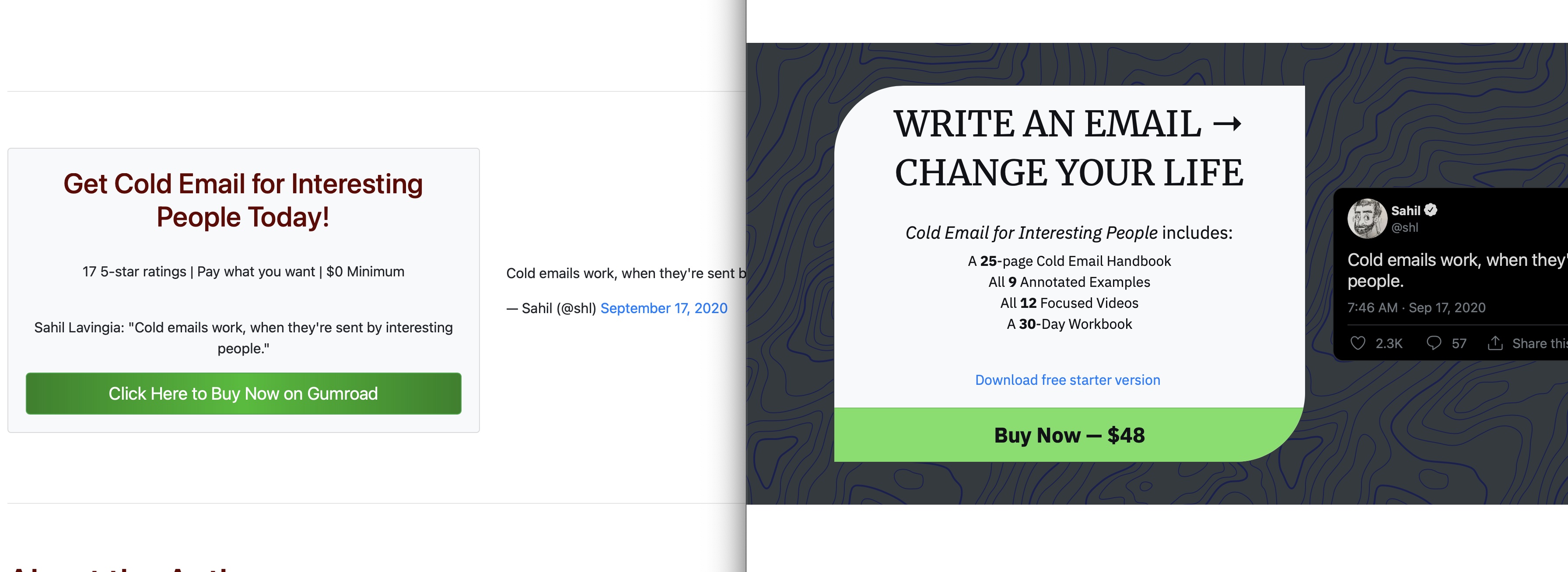
The full-width background makes this section stand out in a stripe against the rest of the page. The wonky card matches designs further down the page, but stands alone solidly against the embedded tweet.
Redesigning this section actually required the most iterations, despite its simple, similar appearance. It took a long series of tweaks to come up with a variant on the original concept that matched the rest of the site.
One final challenge was incorporating the free sample without distracting from the CTA. A text-only link is smaller than a button and performs the roll quietly.
New Section: Contents
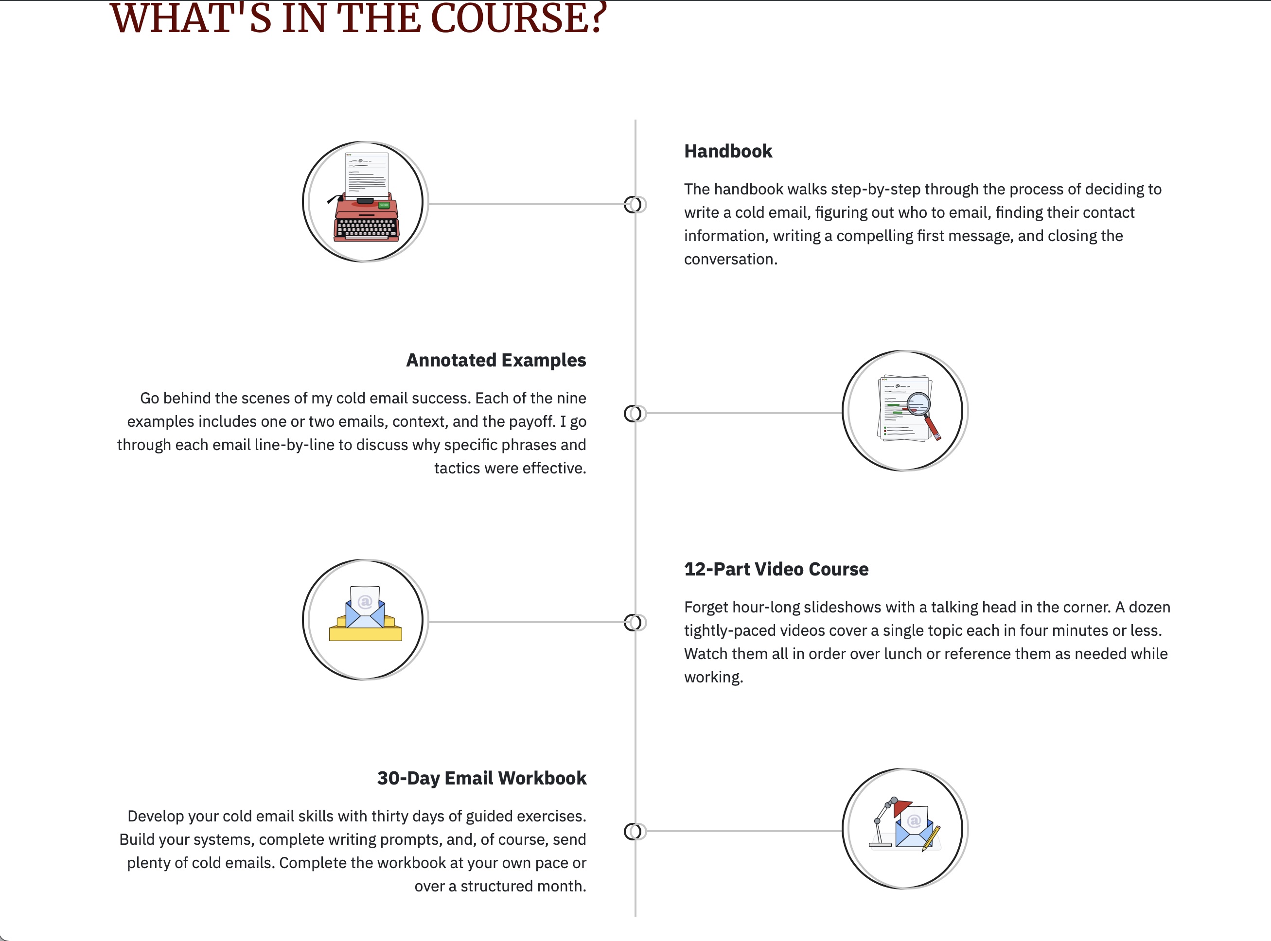
Adapted from an open-source template, this section required me to carefully draft copy within a few characters of the length of the template's "lorem ipsum" snippets to retain appropriate behavior at different screen sizes.
New Section: Reviews
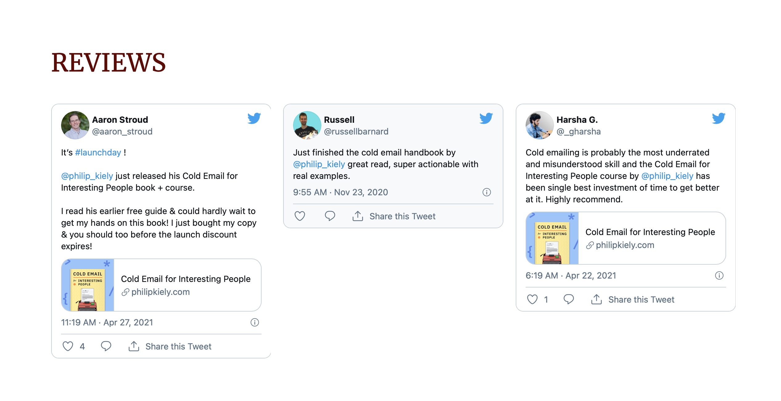
With only three reviews, the true magic of this section is not yet apparent, but the bootstrap column will neatly handle any number of tweets in a masonry-like grid. Three columns marks an important departure from the two-column 6-6 layout elsewhere in the site.
New Section: Main CTA
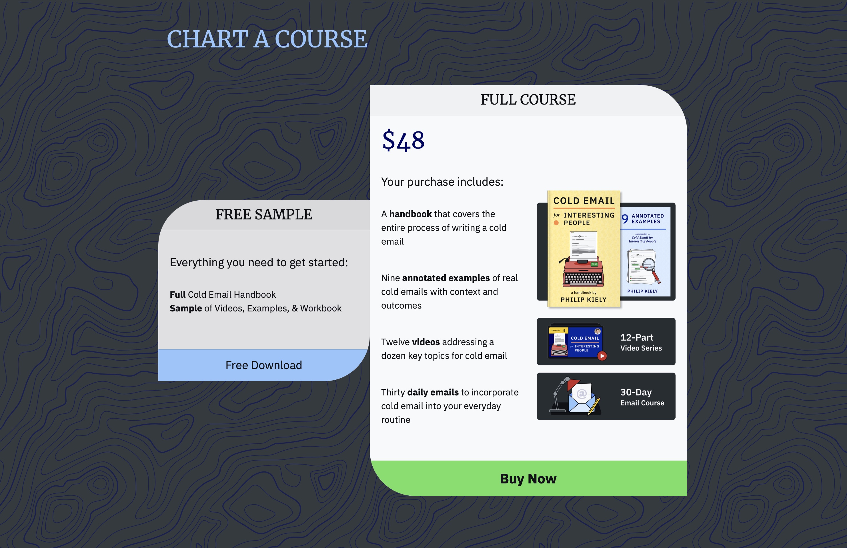
This section features two cards with a 5-7 layout. The main card then has two halves, which centers the most important column of copy on the page. The longer contents of the main card give it greater height and visual precedence, but this required vertically centering the free card relative to it.
The pattern is essential with such a large dark background, and the free card has a less-bright background, making it appear to be a shadow of the main card. The buttons also adopt different colors to keep focus on the paid card.
The uneven rounded corners make the cards appear to be leaning against one another for support. The buttons' overflows are hidden.
About the Author
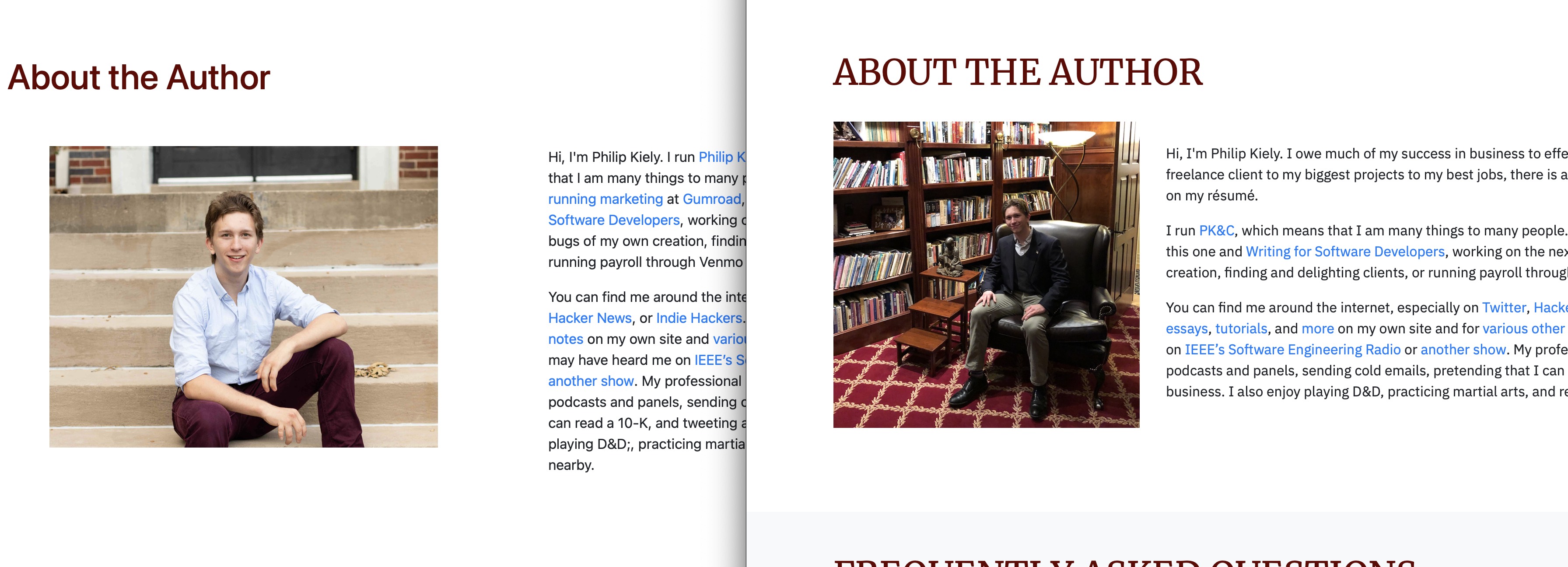
Removing the margins from the photo gives room for a 4-8 layout while keeping the photo nearly the same size. This departure from the 6-6 layout of the rest of the page keeps the section feeling fresh.
FAQ
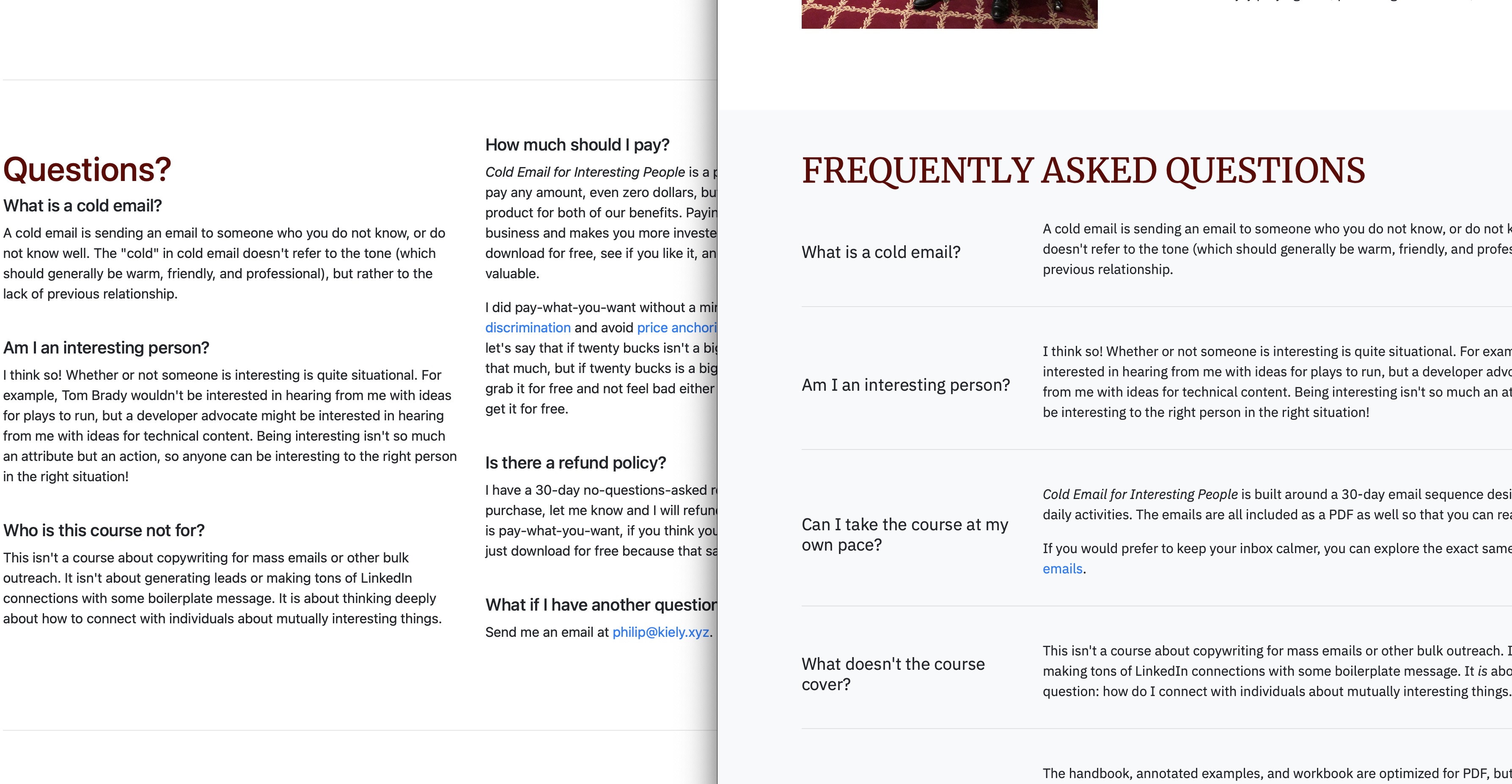
Moving to a 3-9 layout means that the questions are easier to identify and skim. The wider text area for answers means that shorter and longer answers take up more similar amounts of vertical space. Lines separate each question while a full-width background separates the section from the rest of the page and flows neatly into the footer.
Copy Notes
The most elegant landing page in the world would be next to useless without compelling copy. Fortunately, I was able to retain most of the copy from the original page (though much of it needed to be updated for the new product).
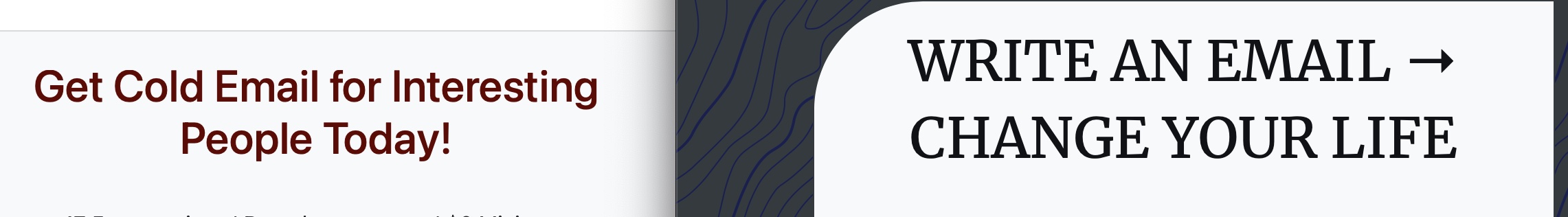
The biggest changes came in headlines.
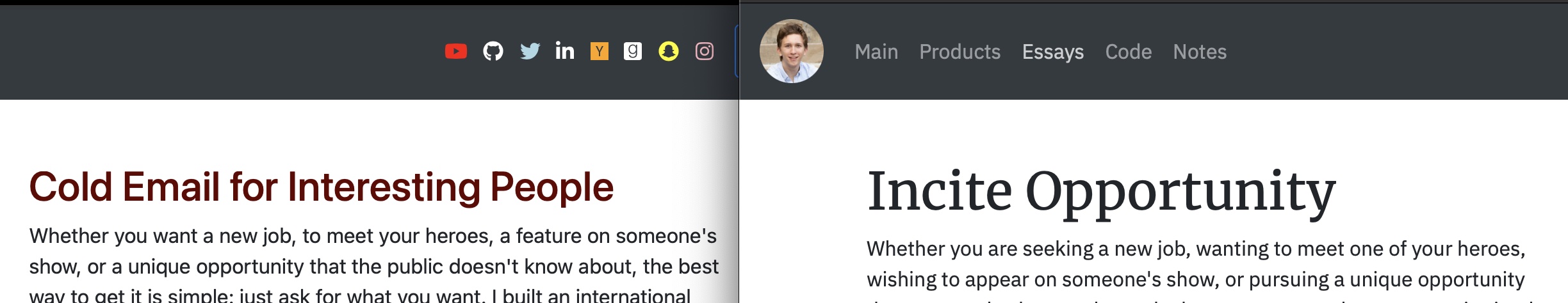
The original "descriptive" headline repeats the title ... information that is right next to it on the page and repeated everywhere from the URL to the bottom of the page. The new headline tells readers what the product does to help them care.
Similarly, the CTA stays instructive, but shifts the value from me (buy my thing) to the visitor (do your thing). These small changes throughout the landing page help the copy live up to the design that surrounds it.